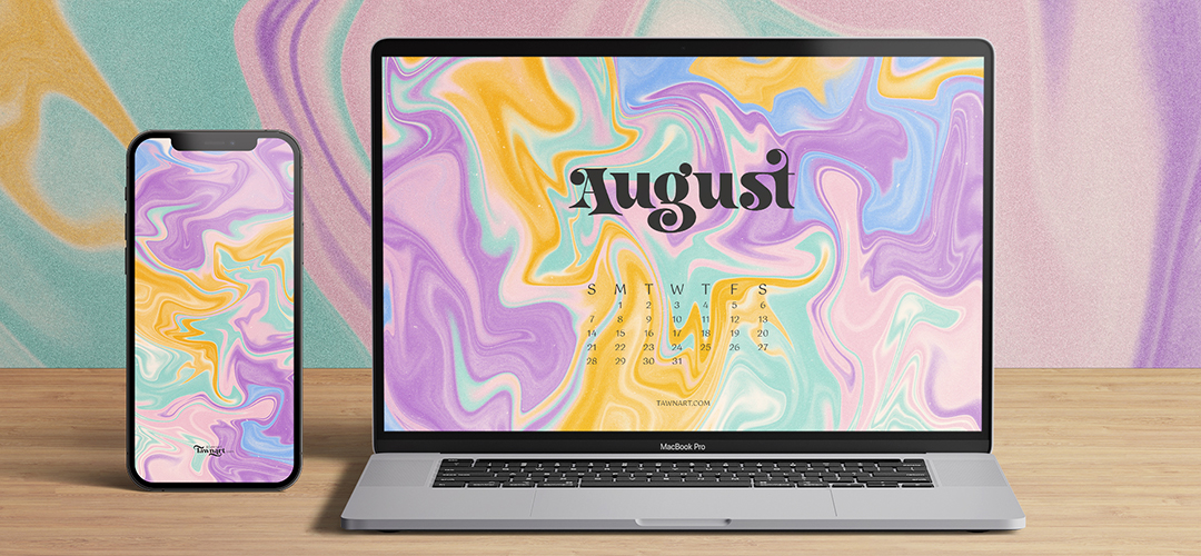
For this set, I wanted to stay away from using the typical classic warm retro colours we usually associate with this look, like oranges and reds. Instead, I opted to go with cooler pastels, like purples, blues, and mint. Which is just so damn refreshing! I added a touch of graininess over those beautifully happy colours to give it a subtle modern twist. To top it off, the font I used just compliments that groovy retro vibe.
I created this abstract design in Procreate using the Liquid filter to get the look I wanted to achieve. And if you’ve never attempted this technique before, I’d suggest trying it out because it was pretty fun to play around with.